Inspiration and Discovery

How will my version be different?
From the reviews of this app and others, most people are complaining about the apps having multiple errors during use, not recording symptoms relevant to arthritis and being complicated to use.
I plan to avoid these issues in my re-design and create a simpler, user friendly app specifically targeted to those with Rheumatoid Arthritis. By re-designing an existing app rather than creating one from scratch, I can leverage the brand name and existing reputation to increase the likely- hood of users downloading and consistently using the app. In future iterations of the product, it will then be easier to introduce paid features.


Interviews
User Persona
What metrics am i using to measure success?
MVP Features
User flow
Designing the App
Lean canvas
Link to Notion Workspace
Link to full persona
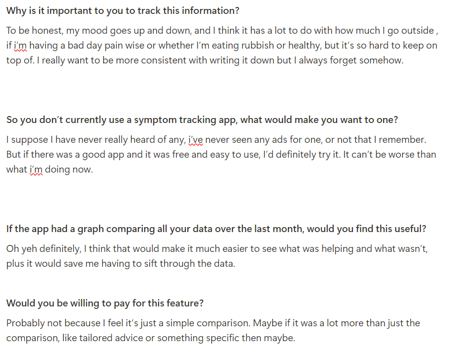
Three user interviews were conducted with participants virtually to discuss their use or familiarity with symptom-tracking apps, their underlying drivers for wanting to record this type of data and what would make them more likely to use such a product.
This data was key to gaining an insight into the core motivation and needs of the user, and thus the underlying thoughts that would drive them and therefore should be kept at the centre of the design process.


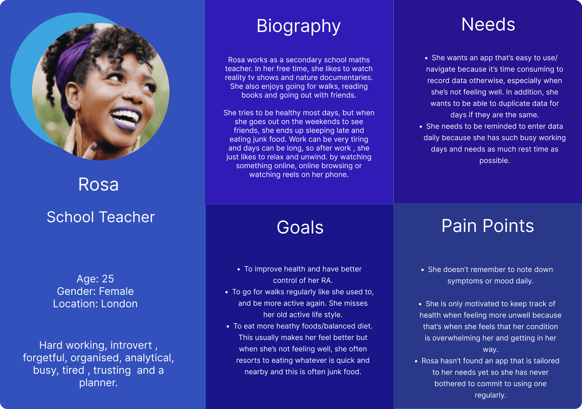
From the empathy map , user interviews and surveys, I created a user persona to summarize a typical user, their goals, needs and obstacles. This will help better align the design process and keep the user at the forefront throughout the entire process.

Three of the main user issues were targeted with possible solutions identified based on user research and interviews. The key metrics for determining product success were also chosen and will be assessed upon completing of designing the MVP. The metric are mainly based on user retention and satisfaction, as these were the main issues with the existing apps on the market.
From the customer segments already identified, I have highlighted those who will be likely to adapt and use the product quickly (early adopters). These are more likely those who are already comfortable using apps to record their data and use their phone frequently anyway.
A UVP (unique value proposition) was defined to clearly communicate the value of my product, how it solves customer issues and why it is superior to existing alternatives. This was concluded by focusing on customer pain points and then determining how this product would help customers overcome these issues.
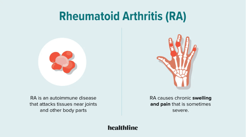
Rheumatoid arthritis is a chronic life-long condition affecting 1-2% of the world’s population, which is about 23 million people. The condition is autoimmune and even with all the current research, the actual cause is largely unknown.
Most people who suffer from it typically experience pain and stiffness in their joints, which can lead to difficulties carrying out normal daily activities. In addition to this, they often suffer from other co-morbidities, depression, extreme fatigue, increased infection risk and take high levels of strong immunosuppressing medications.
A large part of the condition is the uncertainty and sense of loss of control that it brings. Those affected will wake up each day not knowing how they will feel, how tired they will be or how much pain they will be in. As a result, it then becomes nearly impossible to confidently plan ahead in life or even to predict the remainder of the day. As a result, people lose a sense of normality and end up sacrificing the things that they love.
One of the biggest challenges is not knowing what will trigger another flare. Research has shown that many of the triggering factors can be altered through life style changes and thus helping people regain control of their condition. Without the ability to identify and monitor these personal triggers, many are trapped in a frustrating cycle of trial and error, struggling to regain control over their lives while managing their symptoms. The initial step to identifying these factors is to monitor them, and thus a symptom tracking app specific to this user group seems the ideal solution.
Inspiration
My Project
Competitive
Analysis
Surveys
Interviews
Empathy Map
Persona
User journey
Metrics
Habits
MVP Features
Taxonomy
User flow
Wireframes
Logo design
Lo Fi
Prototypes
Style Tile
Final MVP
Link to full user flow
Link to prototype interactions
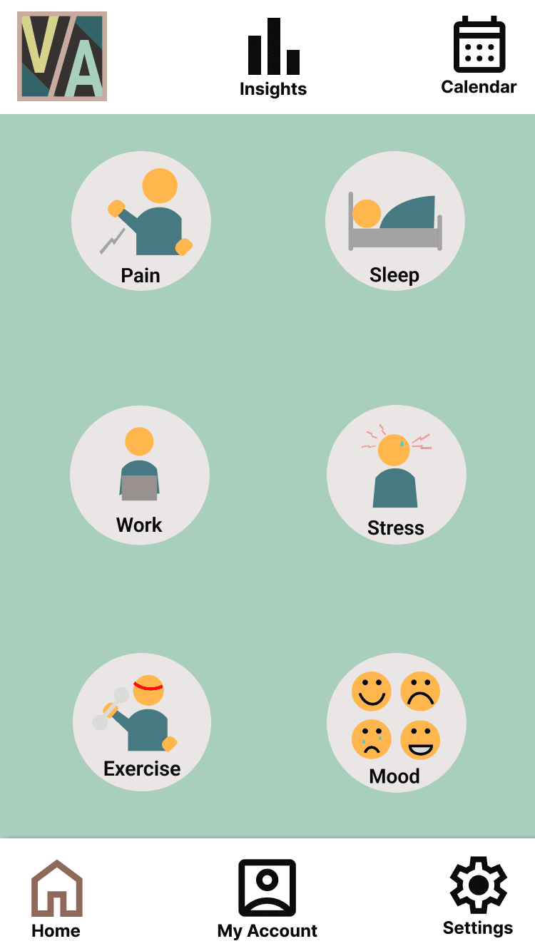
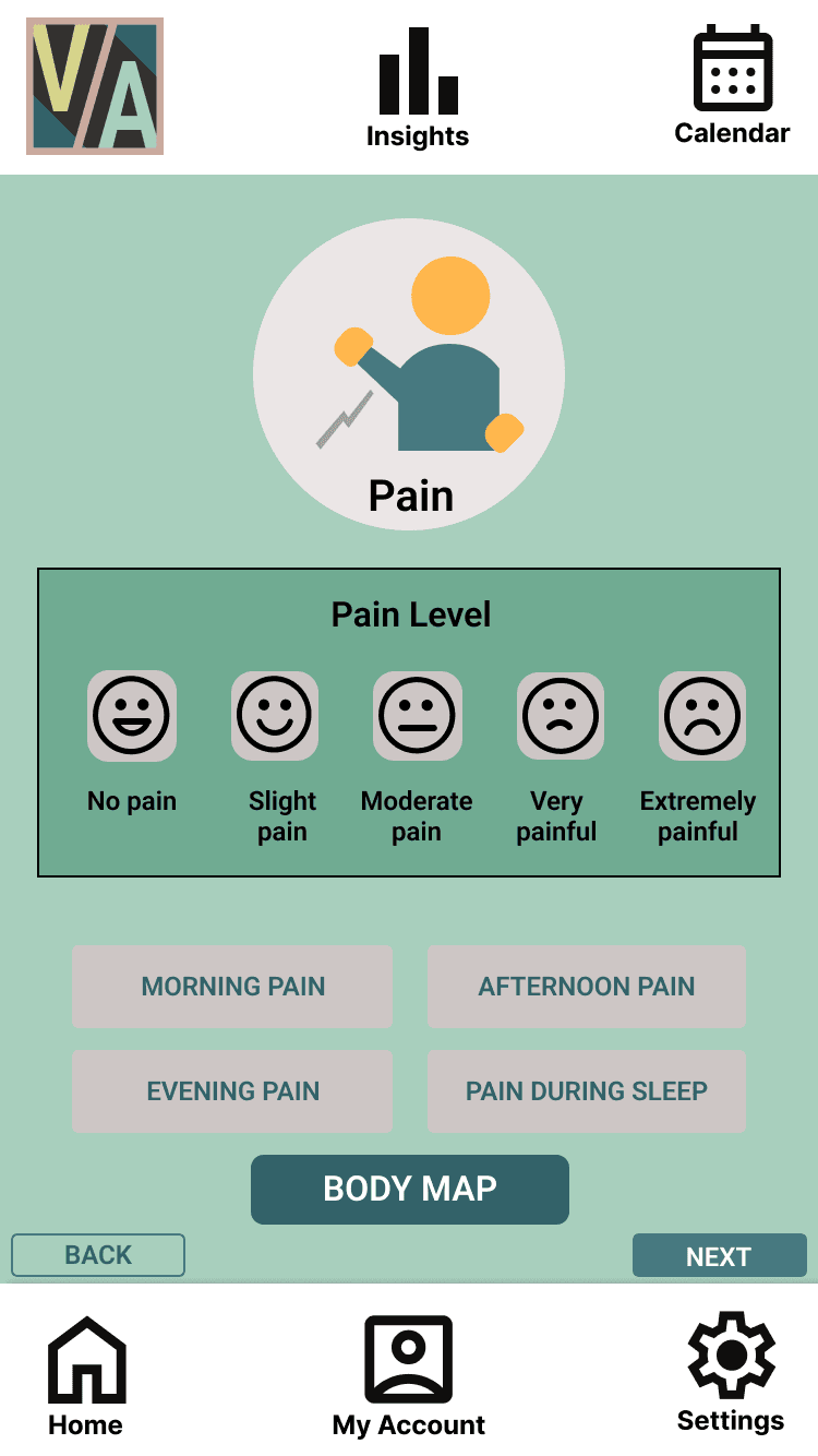
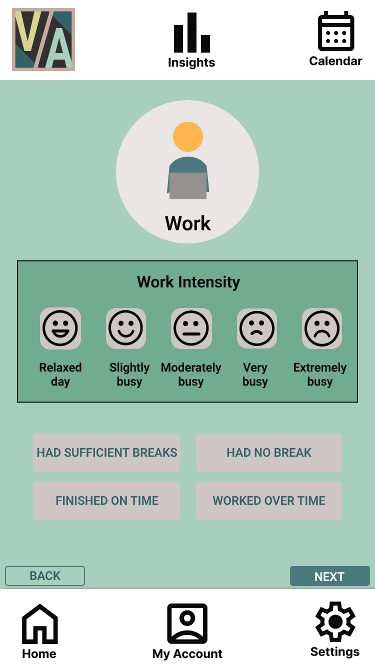
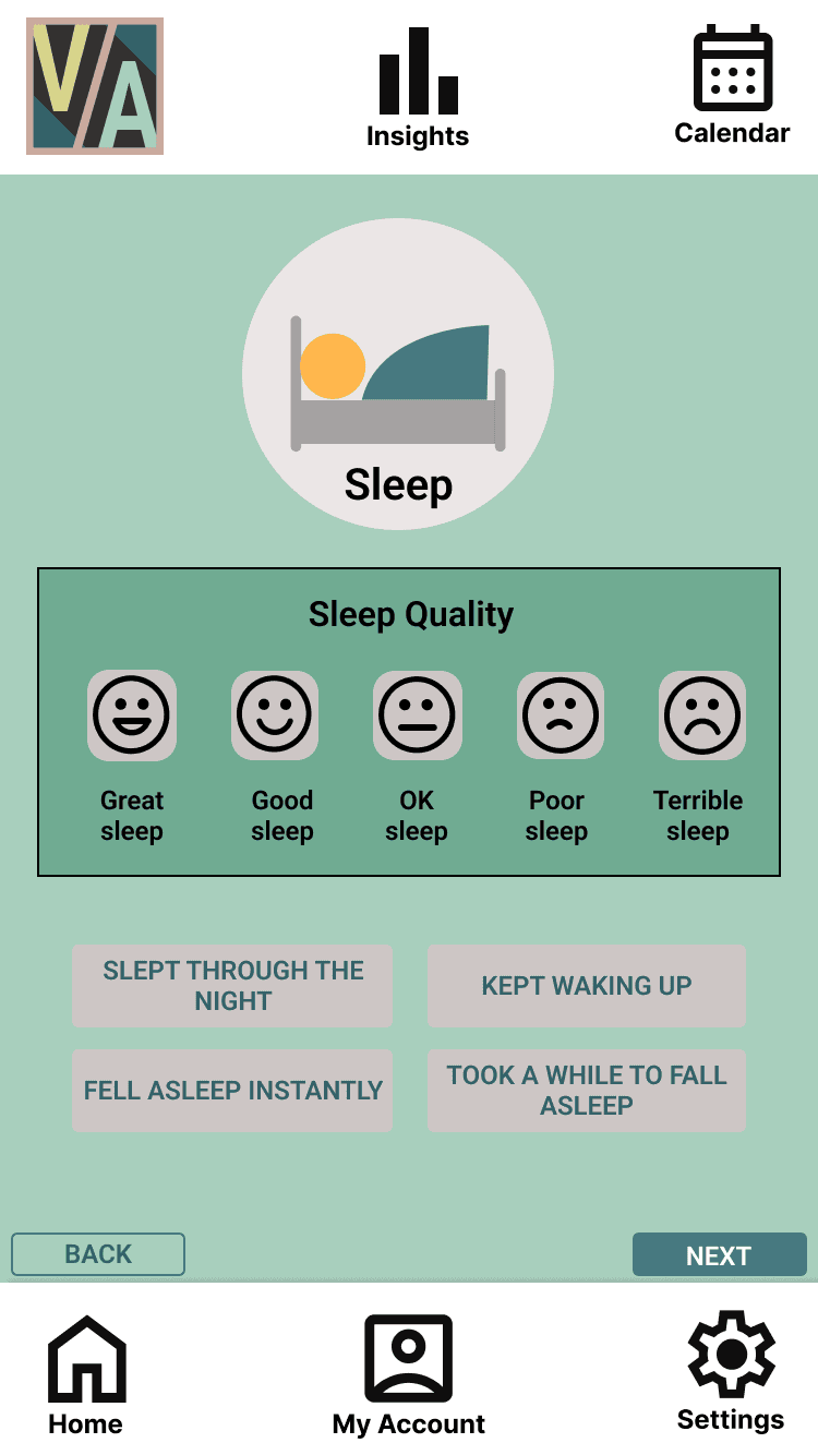
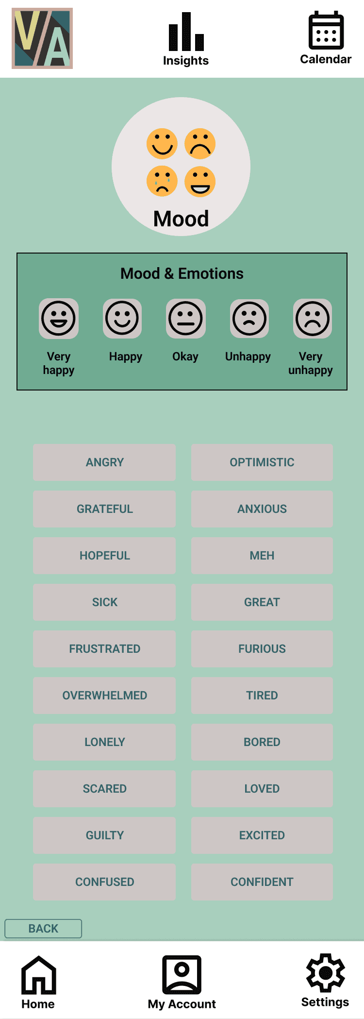
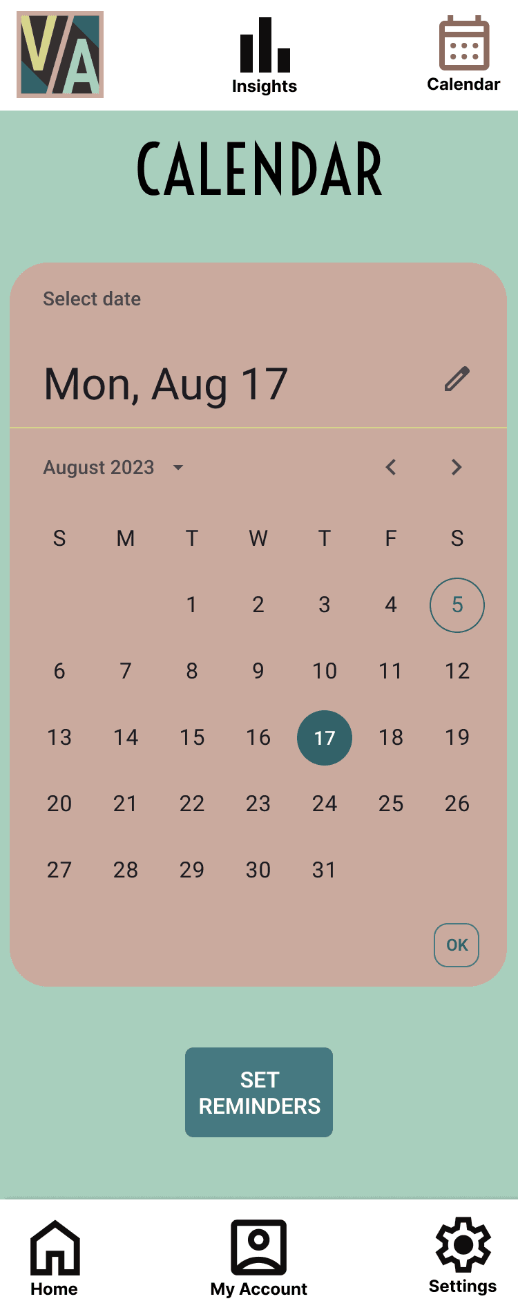
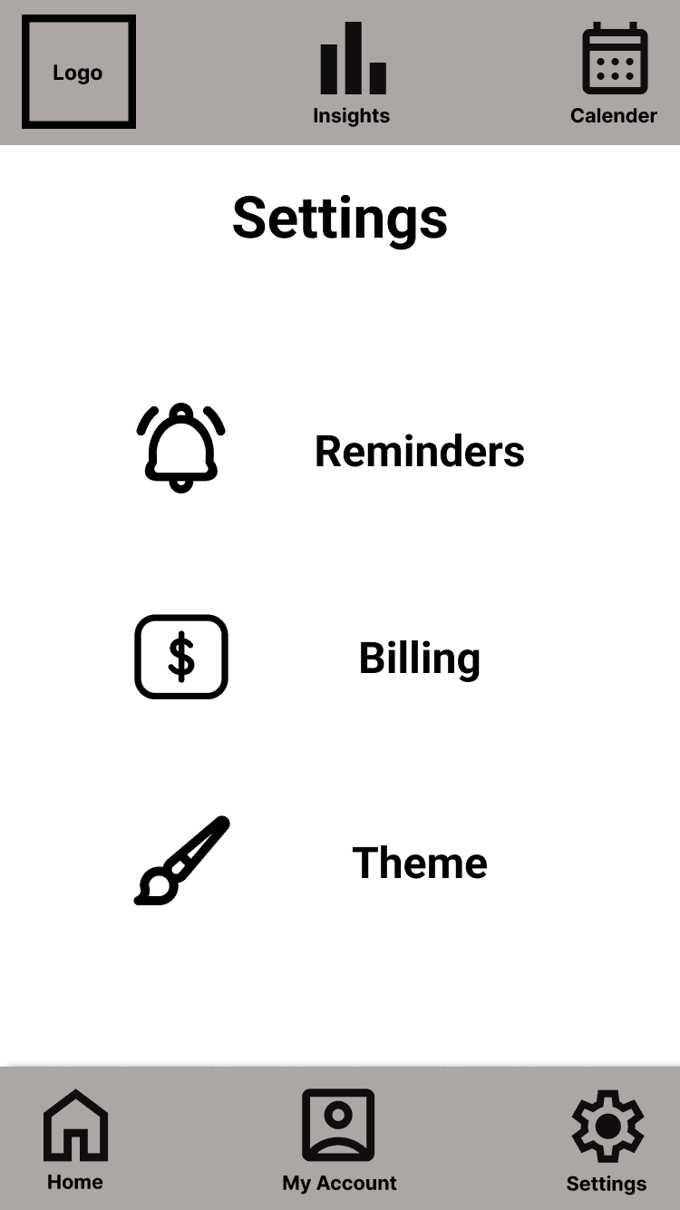
Data to record is more relevant to arthritis sufferers
Users can set reminders to log their details daily
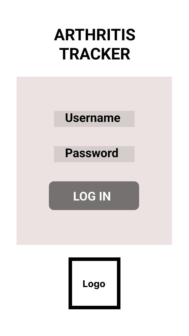
Data will be password protected
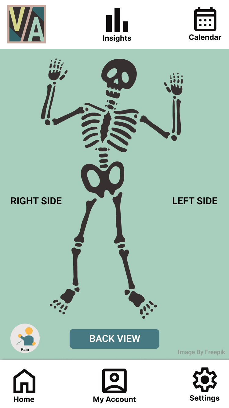
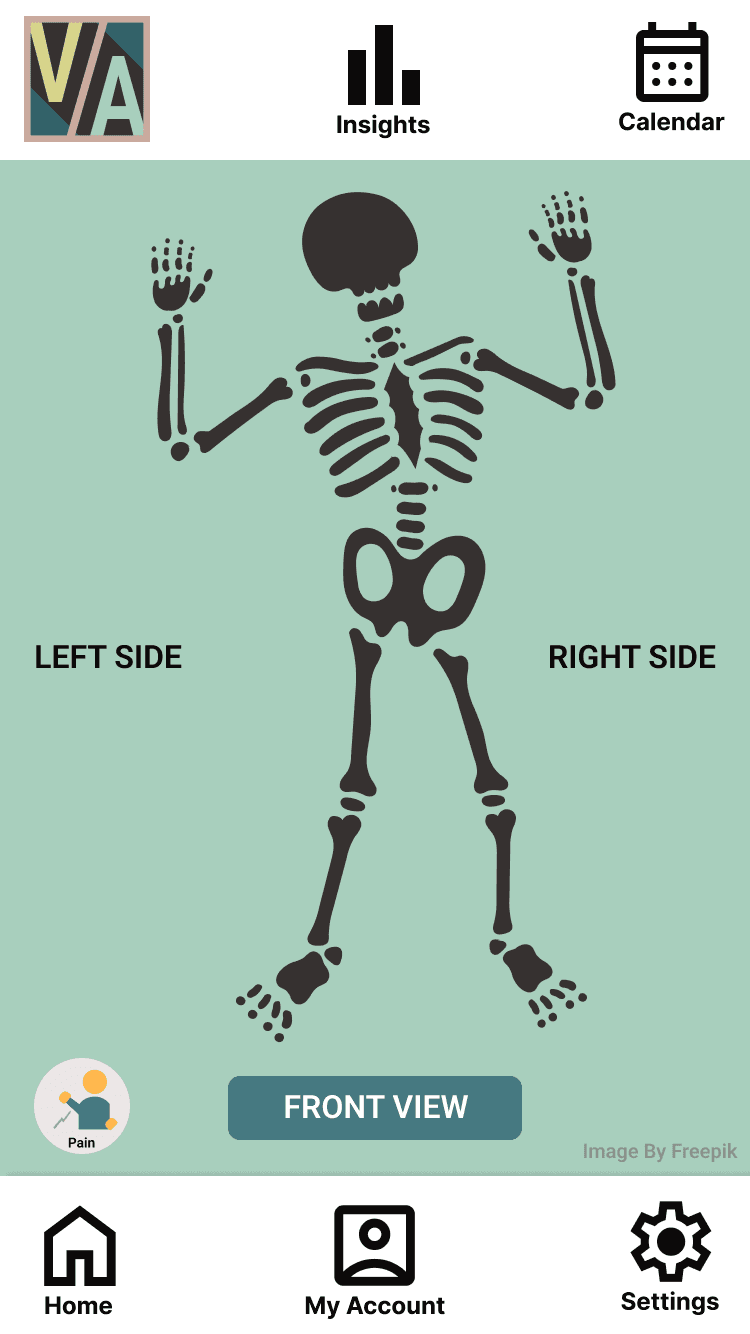
The app has a body map
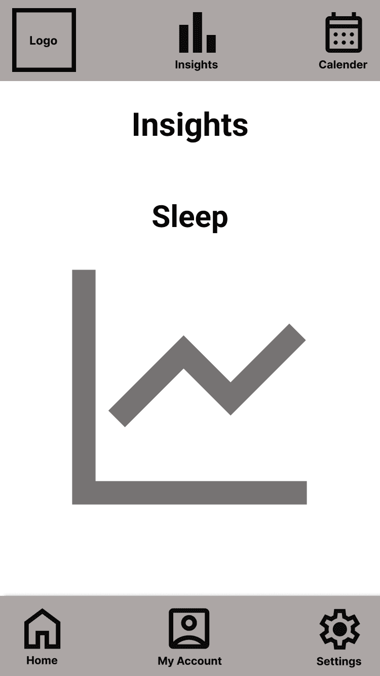
Data comparison will be available to view
Users can look back over past data
A summary of previous data will be provided
Provides daily useful advice and tips
User's can duplicate previous days data
Based on the user research, the following list of MVP features was extracted.
A user flow demonstrates how the user will navigate through the app and the various routes they can take.

Logo re-design
Lo-Fi Prototypes
Re-designed style tile


Original Logo
Logo variations
Final chosen Logo


mirunaalini.alagarajah@gmail.com

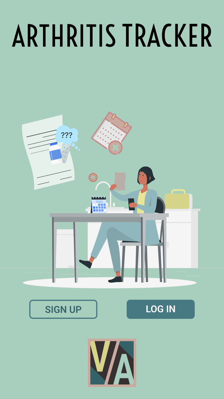
Arthritis tracker
Re-designing an app
What already exists on the market?
shown as graph


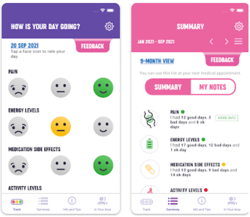
Currently, there are no highly rated and well reviewed arthritis symptom tracking apps on the market. Therefore, for this project, I have decided to re-design an existing app.
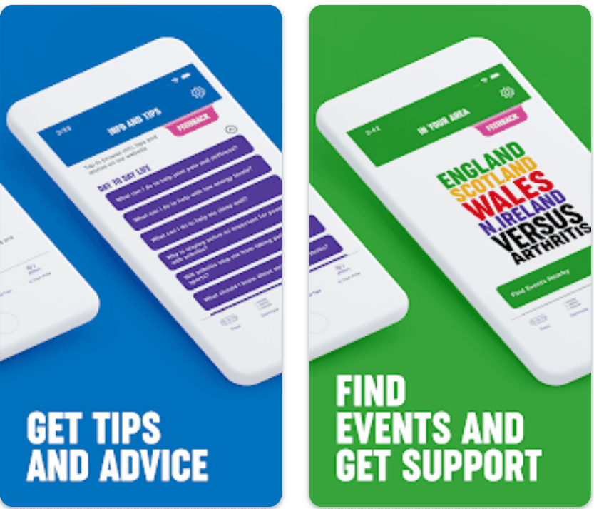
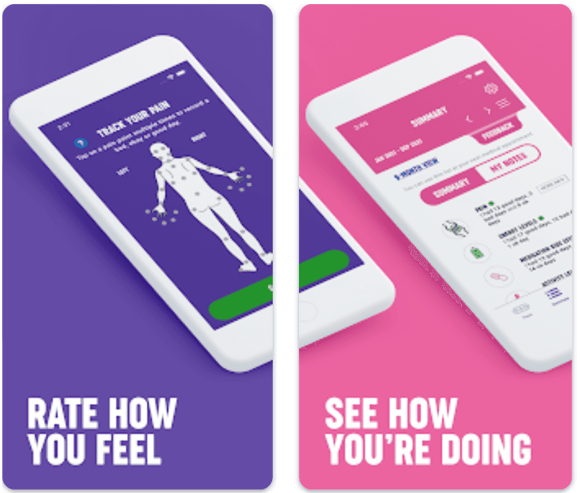
The app to re-design is the Arthritis Tracker by Versus Arthritis as this app comes from a well-known brand, and the website has the highest site traffic by far. The app is specific to those suffering from Rheumatoid Arthritis and the associated website is highly affiliated with ongoing medical research. The existing app is free, providing a daily check in, a summary of past results, general information and tips and events posted in your local area.
The app is generally poorly rated as users feel it has many functional errors and is targeted towards younger users only, even though most Rheumatoid Arthritis sufferers are typically older (average age of onset is 55 years old).
What am I building?

User Research
Pain points to solve for
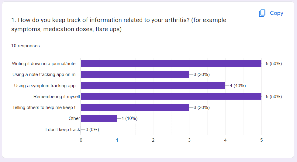
User Surveys
A simple online Google survey was designed to investigate users’ motivation for using apps, what their needs would be and what pain points they may have. A user group was found using an online forum for those specifically suffering from Rheumatoid Arthritis.
The survey was then sent to numerous people who fit into the category of people experiencing some level of Rheumatoid Arthritis, but they did not necessarily use an app to track their data. Below are the most useful findings.
Currently, 50% of users kept track of their data using a journal or just tried to remember the data
70% of users said they wanted to keep track of data to avoid forgetting data/symptoms.
80% said that pain levels was the most significant factor that users wanted to track. 60% also said that they found it moderately difficult to rate their pain level and they needed time to think about it.
70% of users said they wanted to score their symptoms using a mixture of icons and text
If a data comparison was provided, 30% users would find this helpful.
Key Findings:


Empathy Map
To gain a deeper understanding of users and avoid bias/assumptions, an empathy map was created based on existing qualitative research and the user persona. This will help me gain a deeper understanding of the users and aid in decision making

Current User Journey
User Journeys
New User Journey
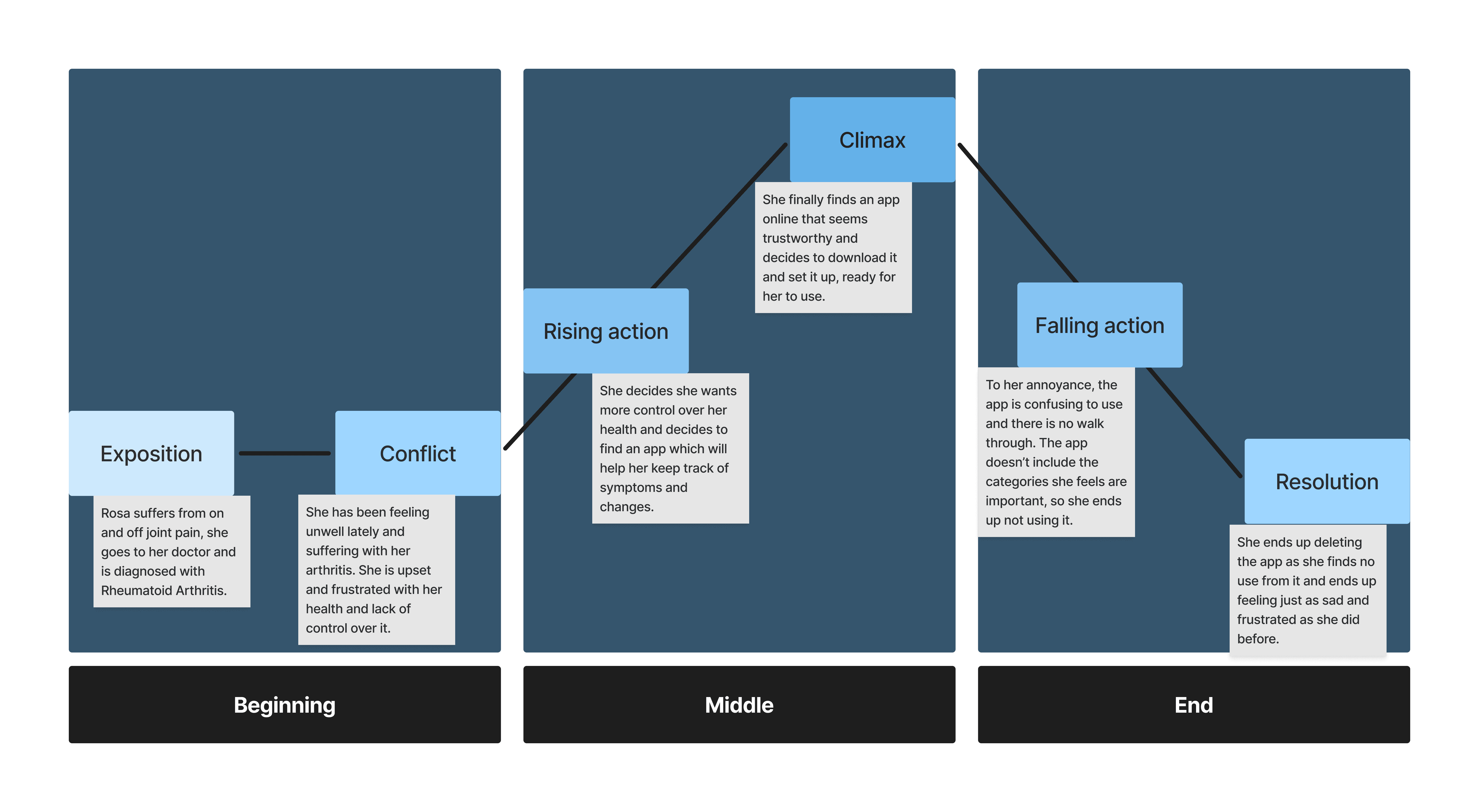
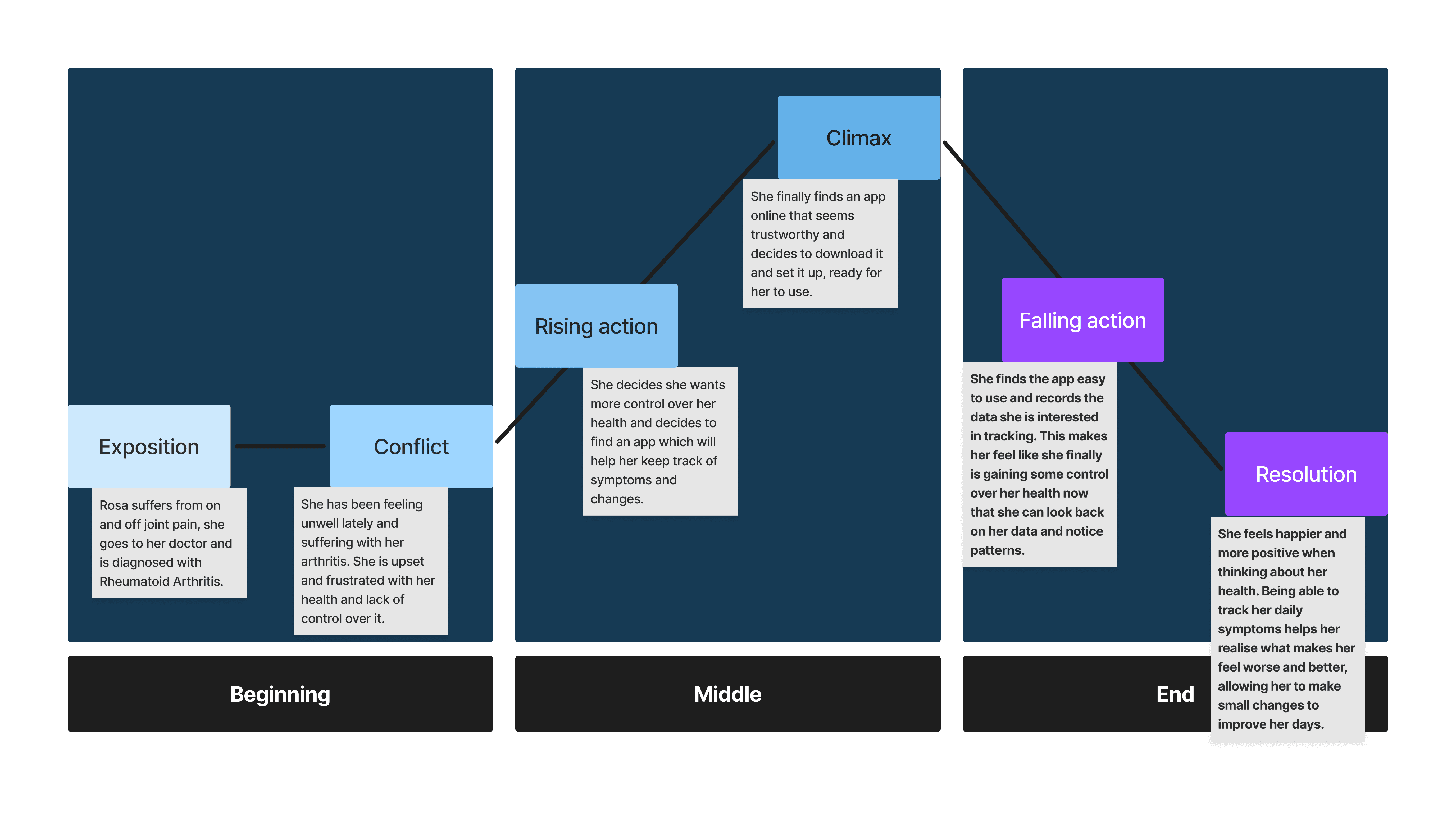
Comparing the existing user journey with what I want the user journey to be, will help guide how I want my app to be different from what exists on the market currently.
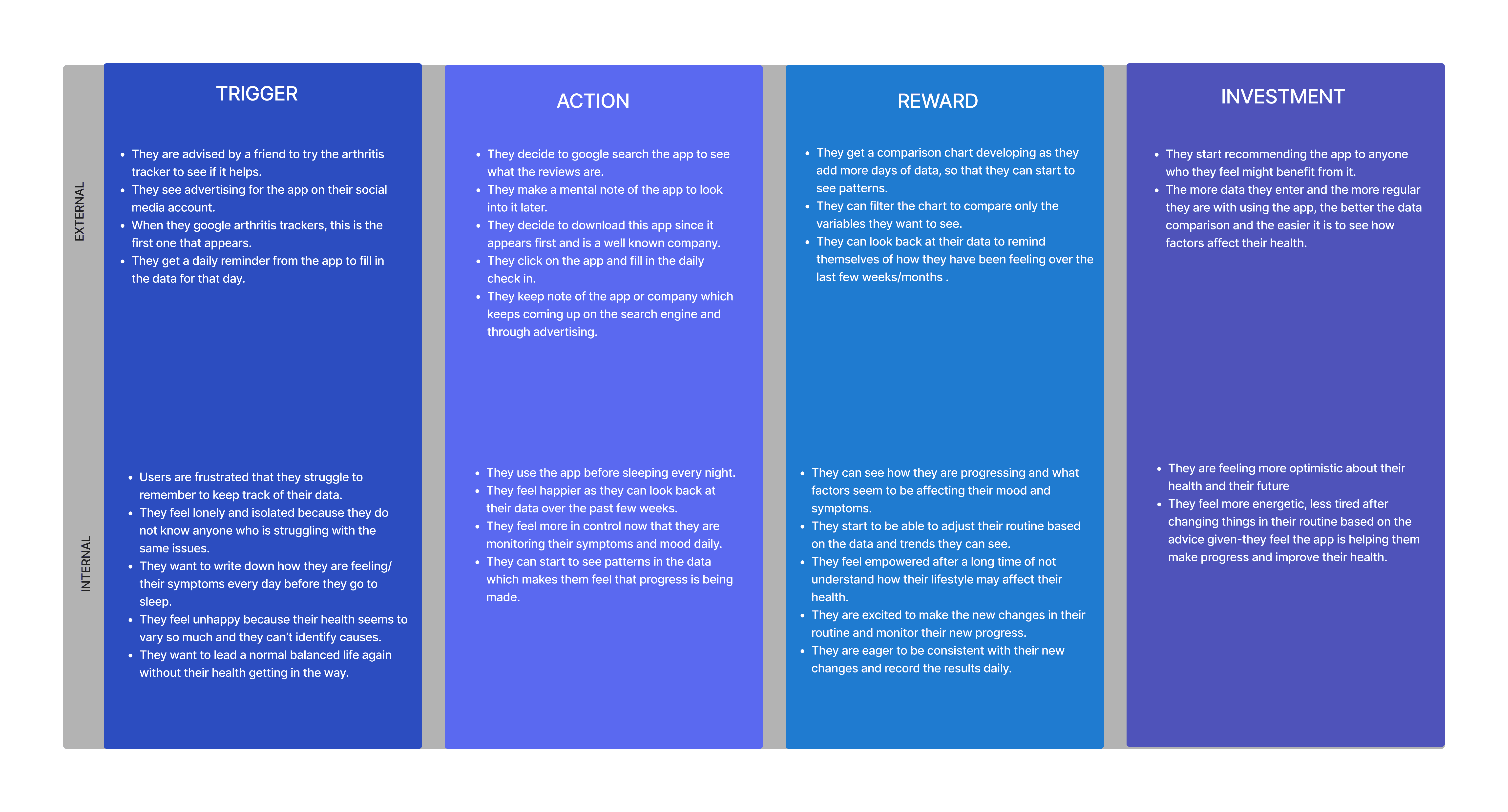
How do I create a daily habit for my users?
Hook Model
Link to Hook Model
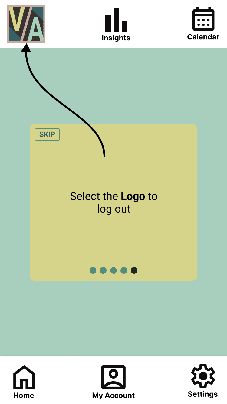
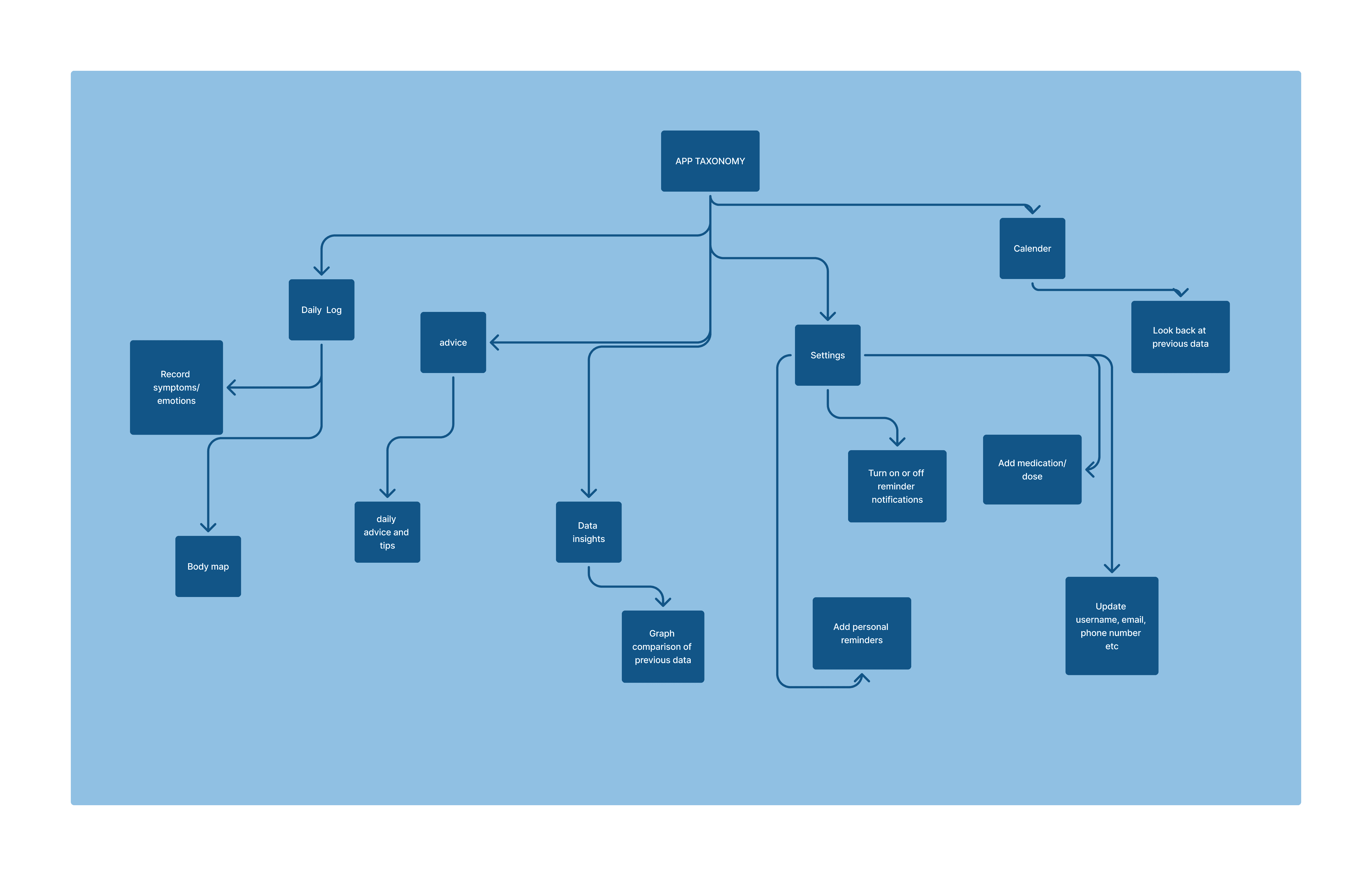
App taxonomy
A taxonomy was created to show how the different screens will link together.

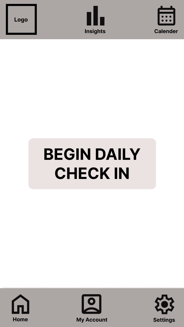


Lo-Fi Wireframes
Simple wireframes were built in Figma to depict basic layout and page set-up, as well as pages needed for future detailed design. The pages were based on the user flow and taxonomy above.
Intial style tile
Using the original logo, I created some variations and eventually decided on using the first two letters of each word for simplicity and aesthetics. Colours for the logo were based on the below chosen colour palette.
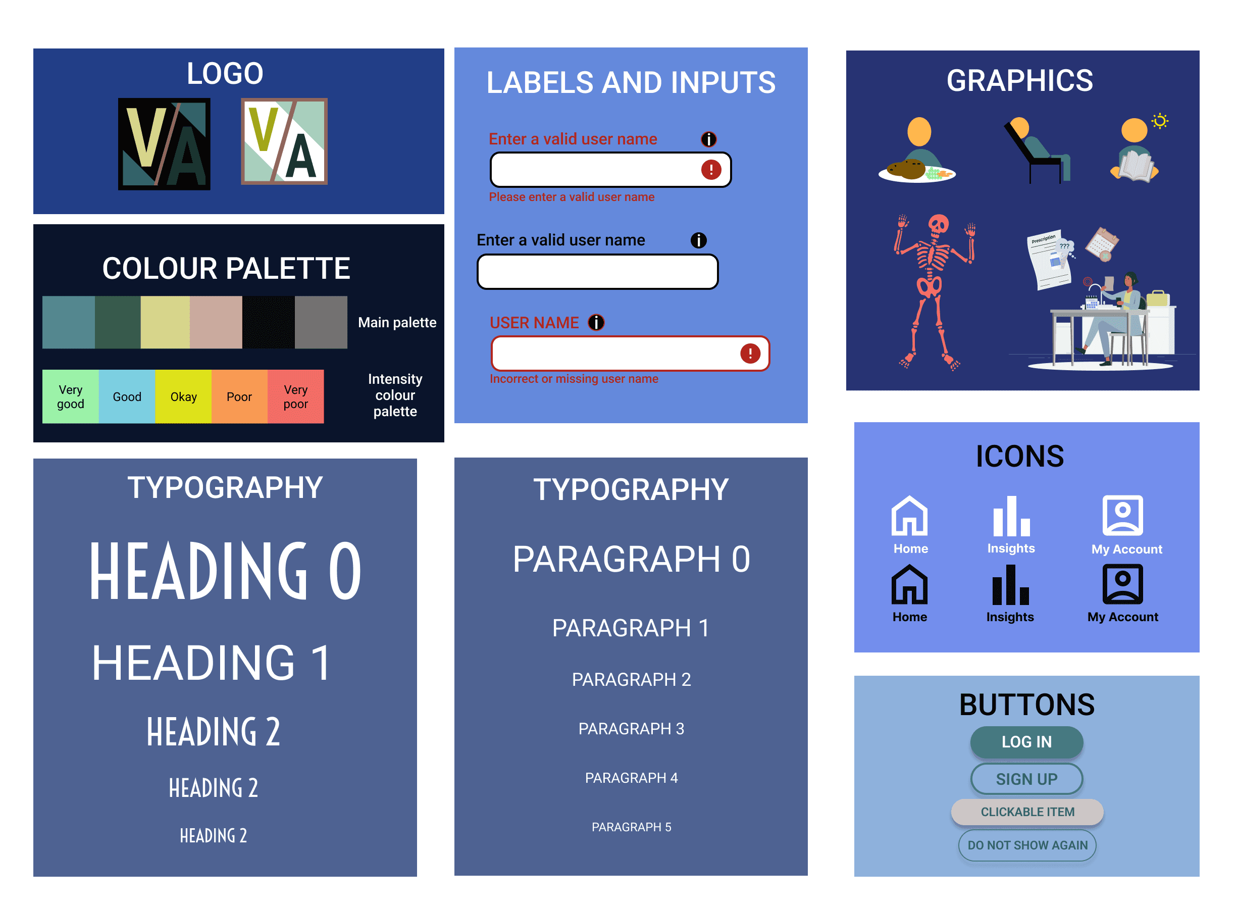
I created a style tile to communicate the core of the product’s visuals and to act as a smaller version of the brand’s style guide.
The chosen colour palette was based on my discovering from my moodboard, with a colour intensity palette which will be used to indicate levels of each symptom scored. A full colour palette with varying shades of each hue was created (see below).
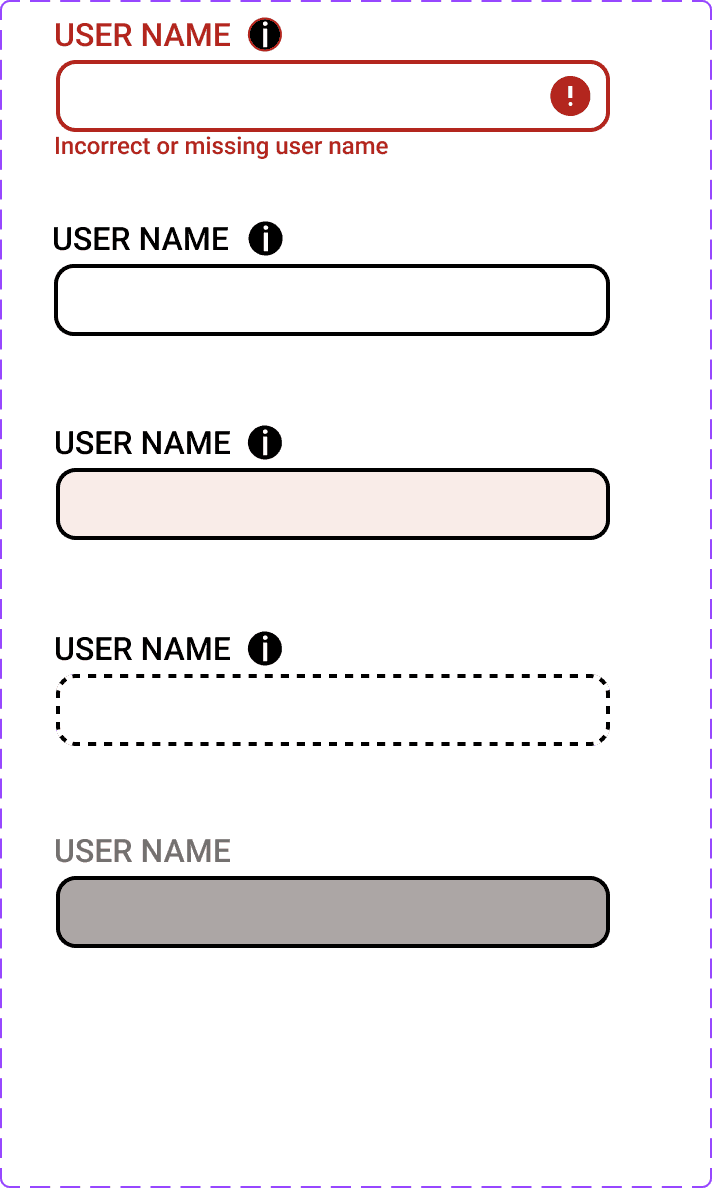
Input box styles were based on the Material design kit, with additional features added.
Graphics were adapted and modified from existing graphics to suit the existing colour scheme.
Icons were also adapted from the Material design kit, and modified to make them uniform and obvious as to their function but having name labels beneath.
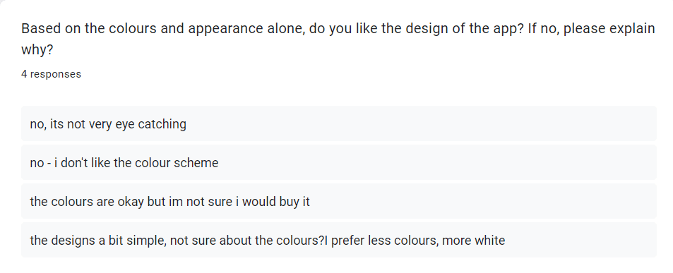
Evaluating my design
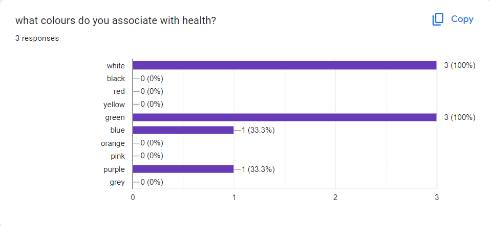
Since the colour scheme was chosen without user involvement but just based on existing colour schemes associated with health, now that the lo-fi version of the prototype is complete, I decided that I needed to assess the design and colour scheme of the app before continuing further.
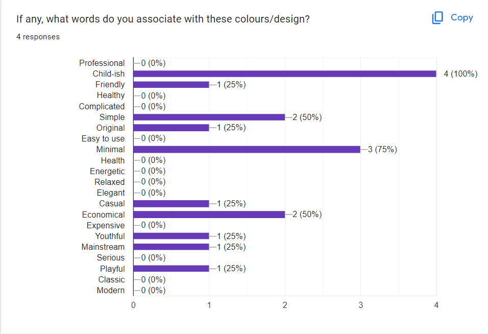
A survey was sent to participants with the following edited screen from the app.
The results below show that the app was mostly associated with the words ‘child-sih’, ‘simple’ and ‘minimal’. None of the users guessed that the app was in the sector of health or symptom tracking and instead assumed it was related to gaming/children.
None of the participants liked the chosen colour scheme so I decided re-design the app, looking at more existing apps on the market. I used the two most chosen colours of green and white to guide my re-design.

Final MVP
